BRAND KEYWORDS
Geometric, Cultural,
Mystical
Caren Ortiz is a jewelry studio that specializes in crafting exclusive golden pieces. Their new branding is inspired by the beauty of Mexico's landscapes while celebrating the country's rich cultural heritage.

Geometric, Cultural,
Mystical


The branding draws inspiration from early civilizations gazing at the star-filled night sky. We selected black and gold as the primary colors to capture the scene and complement the jewelry. As the secondary color, we used sandy beige to reflect the serene beauty of cactus-studded deserts and pristine beaches, transporting customers to the heart of Mexico's breathtaking landscapes.

A Blend of Geometric Forms and Mexican Symbolism. The central focus is on the Polaris- a sun, a star. Its radiant glow evokes the sparkling image of golden jewelry. It is formed by mirrored cactus spines.
The main logo features the sun surrounded by circles and triangles. These geometric elements carry profound symbolism in Mexican culture: circles represent wholeness and the eternal cycles portrayed in ancient Aztec and Mayan calendars. Meanwhile, triangles, embody the trinity of life - the past, present, and future.


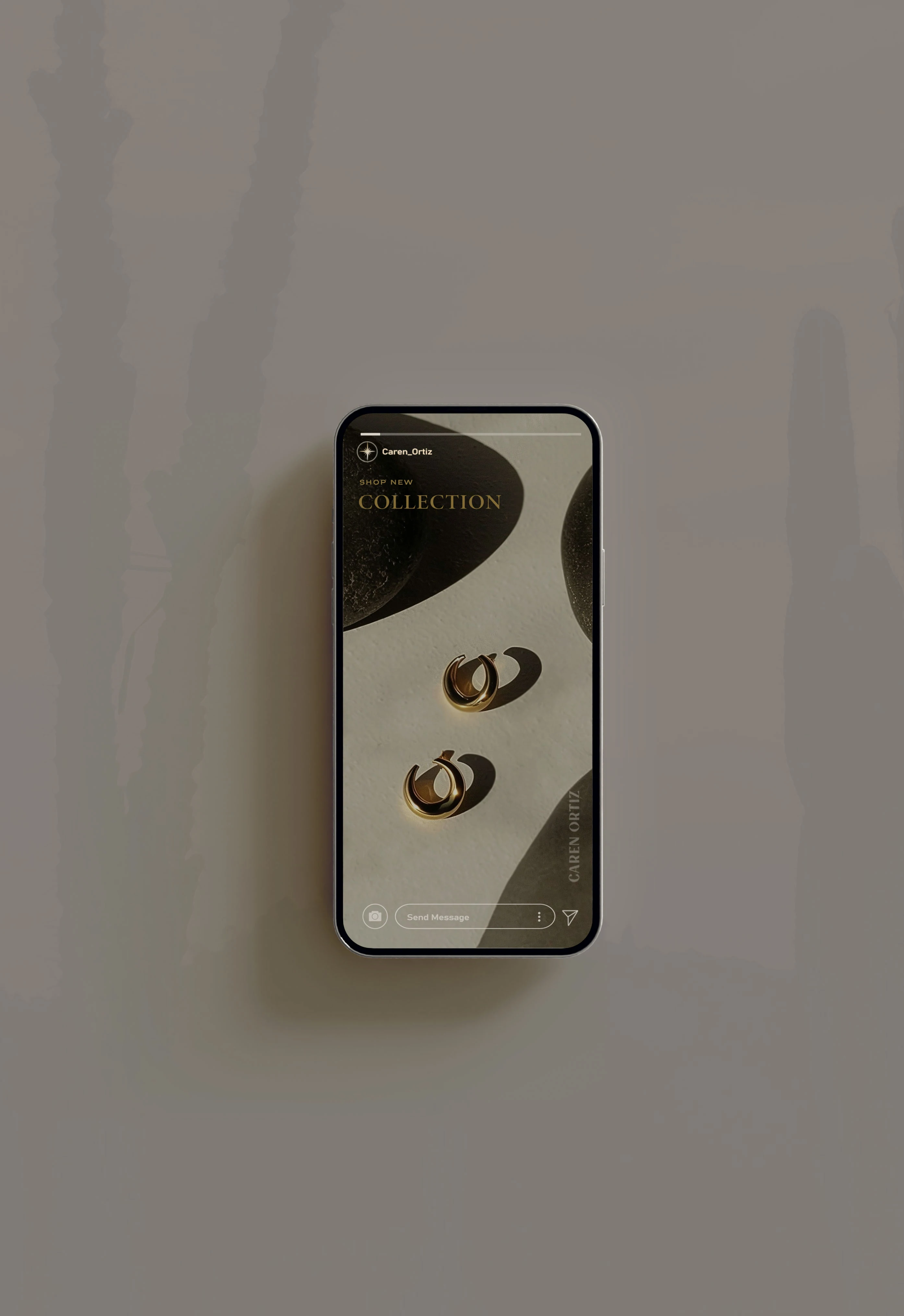
We have incorporated the simple Polaris icon from the main logo design to ensure instant brand recognition on social media platforms. This icon not only scales seamlessly but also serves as collateral to draw attention to the call-to-action elements. Across all channels, we maintain a brand experience with a consistent color palette with golden tones, adding an elegant touch and complementing the jewelry.
"I had an amazing experience working with Petra. Her attention to detail was so impressive. She's really talented at what she does. The final design was even better than I hoped for. Can't wait to work with her again on future projects!"